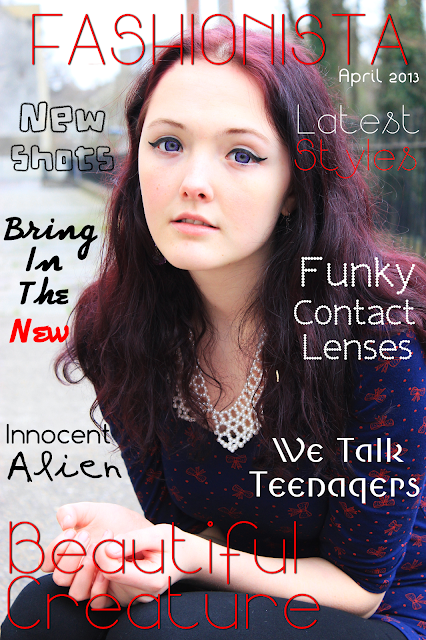
So recently I have been experimenting with making up my own magazine/book covers with my photos. I wanted to see what my photos would look like if they happened to get onto the front cover of a magazine (wishful thinking!). However, while making them I found that it was actually quite difficult to find a photo that had enough room for the title and other writing. I realize now that this is something I should take into consideration when shooting.
The photos from mock-ups 1 & 4 are from a new shoot coming up next. Keep an eye out for the next post!
Links To Shoots From The Mockups:
1 - (Awaiting Post)
3 - The Runaway
4 - (Awaiting Post)
6 - Black & red
Note: The title and other various names/websites included in the mockups have been made up. Any comparison to real life is purely coincidental.


No comments:
Post a Comment